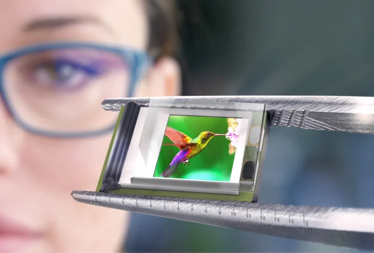


A screen can look sharp and still feel slow. That is the part many Apple buyers miss when they compare iPhones, iPads, or MacBooks in a store. Retina Display Versus ProMotion is not a battle between two versions of the same feature. One describes how clean and dense the image looks. The other describes how smoothly the screen updates when you scroll, draw, play, or move between apps. For American buyers comparing an iPhone, iPad Pro, MacBook Pro, or Studio Display, the real question is not which term sounds more premium. It is what you will notice after a week of use. A student reading PDFs, a designer checking fine text, and a gamer watching motion all judge the screen in different ways. That is why a plain spec list can mislead you. A helpful consumer tech guide should separate clarity from motion before recommending a device. Apple’s own support pages describe ProMotion technology as an adaptive system that can adjust refresh rate up to 120Hz on supported displays, which is the key difference most shoppers feel first.
What Apple’s Screen Names Actually Mean
Apple screen language can feel like a stack of labels: Liquid, Super, XDR, Ultra, True Tone, P3, HDR, and ProMotion. Some describe the panel type. Some describe color. Some describe brightness. Some describe motion. The trap is thinking every name tells you the same thing. It does not. Apple display technology is easier to understand when you place each term into one bucket: sharpness, color, brightness, or movement.
Why Sharpness Comes From Pixel Density
Sharpness is the first thing most people notice because text either looks clean or it does not. When you read an email on an iPhone or edit a Google Doc on a MacBook, the edges of letters matter. A high-density Apple screen packs pixels close enough that normal viewing distance hides the blocky pattern you might see on an older or cheaper panel.
That does not mean every Apple screen has the same density. A Mac display is viewed farther away than an iPhone, so it does not need the same pixels per inch to feel sharp. Apple’s Pro Display XDR, for example, is listed with a 6016-by-3384 resolution at 218 pixels per inch, while Apple still presents it as a 6K high-density pro display.
Here is the non-obvious part: more pixels do not always make the screen feel better. Once text already looks clean at your normal distance, extra density may matter less than brightness, coating, contrast, or refresh behavior. That is why a 60Hz 5K desktop display can look crisp for writing but feel less fluid than a smaller 120Hz iPad during scrolling.
Why Motion Comes From Refresh Behavior
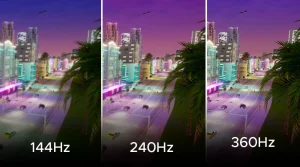
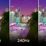
Motion is a different sense. It is not about how much detail sits on the screen. It is about how often the screen redraws what you see. A 60Hz display can update up to 60 times per second. A display with a 120Hz refresh rate can update up to 120 times per second when the device and content allow it.
You feel this when scrolling a long web page, using Apple Pencil, gaming, or moving quickly through Photos. The screen seems to follow your finger with less drag. It is not magic. It is timing.
ProMotion technology matters because it can adapt instead of sitting at one fixed speed. Apple says the iPad Pro display can adjust refresh rates from 10Hz to 120Hz, which helps the screen match the task rather than run at top speed every second. That is why motion can feel smoother without needing every app to behave like a fast game.
The friction begins when buyers treat smoothness as the same thing as image quality. A fast screen can still have poor color or weak brightness. A sharp screen can still feel stiff. The best Apple device for you depends on which weakness would annoy you more.
How Retina Display Sets the Clarity Baseline
The clarity label is the foundation. Before you ask whether a screen feels fast, you need to know whether it looks clean enough for daily use. On Apple devices, the high-density screen idea changed how people judged text, icons, and photos. It made jagged edges feel old. It also created a habit: many buyers now assume all modern Apple screens are sharp, then focus on higher-end motion features.
Text, Photos, and Interface Edges
Text is the honest test. Video can hide a lot because frames move and colors distract the eye. Text sits there. If a screen has weak density, small letters show rough edges. On a high-density Apple screen, a calendar invite, Safari article, or spreadsheet looks calmer because the pixels do not call attention to themselves.
Photos benefit too, but in a different way. A family photo on an iPhone may look better because hair, fabric, and skin texture have more room to appear clean. Yet photos also depend on color handling, brightness, and contrast. Sharpness alone cannot rescue a dim screen in harsh sunlight or a poorly edited image.
This is where smartphone display comparison tips help. A shopper should test the same real task on each device. Open a dense article. Zoom into a map. Look at a photo with fine detail. Then scroll. Your eyes will tell you which feature matters more.
Why Larger Screens Need Different Expectations
A common mistake is comparing iPhone and Mac screens by one number. Pixels per inch sounds simple, but viewing distance changes the result. You hold a phone close. You sit farther from a desktop monitor. A lower ppi on a larger screen can still look sharp because your eyes are not pressed against it.
Apple’s Studio Display is a good example. Its technical specs list a 27-inch 5K panel, 5120-by-2880 resolution, 218 pixels per inch, and a 60Hz refresh rate. For writers, coders, and photo editors, that can be an excellent clarity-first screen. For someone used to a 120Hz iPad Pro, it may feel less lively during fast scrolling.
That contrast surprises people. The more expensive-looking desk setup is not always the smoother one. A U.S. freelancer editing product images in Lightroom may prefer the big 5K canvas. A college student switching between notes, PDFs, and sketching may care more about motion on an iPad Pro. Same brand. Different win.
Where ProMotion Technology Changes Daily Use
Once clarity is good enough, smoothness becomes the feature you feel in your hand. ProMotion technology does not make a bad photo sharper or a low-quality video higher resolution. It changes the rhythm of interaction. The device feels closer to your finger, trackpad, or Pencil stroke. That feeling can be hard to explain until you go back to a slower screen.
Scrolling Is the Demo, but Not the Whole Story
Apple often sells smooth screens through scrolling because it is easy to see. Open Safari, flick a page, and the text moves with less stutter. The benefit is clear. Yet scrolling is only the front door.
Drawing is a better test. On an iPad Pro, Apple Pencil feels more natural when the display can refresh faster and match the hand movement with less delay. This matters for artists, students marking PDFs, and anyone who writes notes by hand. The ink appears to stay closer to the Pencil tip.
Games benefit too, but only when the game supports high frame rates and the device has enough power. A 120Hz refresh rate does not force every game to run at 120 frames per second. It gives supported content more room. That distinction saves buyers from expecting every app to look changed overnight.
Adaptive Refresh Helps Battery and Comfort
The smartest part is not peak speed. It is restraint. A screen that can slow down for static content and speed up for movement makes more sense than one locked at full speed. Reading a still page does not need the same refresh behavior as gaming or drawing.
This is why adaptive refresh can help both feel and efficiency. The device is not wasting top-speed motion when you stare at an email. Then, when you swipe through a long page, it can ramp up. Apple’s support page says certain MacBook Pro models with Apple silicon can use ProMotion, while some supported displays offer adaptive refresh choices.
The counterintuitive part is that you may notice ProMotion most when it disappears. After a few days on a fast iPad or iPhone Pro model, a 60Hz screen can feel slightly sticky. Not unusable. Not broken. Just less connected. That is why people who say they “do not care” about refresh rate sometimes change their mind after living with it.
How to Choose the Better Screen for Your Apple Device
Buying by display label alone is a weak strategy. The better method is to match the screen feature to the work you do most. Apple display technology covers many needs, but no single term guarantees the best device for every buyer. A screen for writing, a screen for drawing, and a screen for gaming should not be judged by the same top-line phrase.
Choose Clarity First for Reading and Editing
Choose the sharper, larger, or better-calibrated screen when your work stays still for long stretches. Writers, accountants, students, web editors, and photo reviewers spend hours looking at fixed details. For them, clean text, size, brightness, and color may beat high refresh.
A MacBook Air can be the right choice for a remote worker who edits documents, uses Slack, and watches Netflix at night. The person may not need ProMotion technology. They may gain more from battery life, portability, and price. This is especially true for buyers who keep devices for four or five years and care about total value.
For deeper buying help, a guide to choosing the right Apple laptop display should ask about task type before screen labels. That is more useful than telling everyone to buy the highest model.
Choose Motion First for Touch, Pencil, and Games
Choose smoother motion when your device is something you touch and move through all day. iPad Pro owners feel this during Pencil work. iPhone Pro users feel it in long social feeds, maps, sports apps, and mobile games. The screen becomes part of the physical experience, not only a viewing surface.
This is also where the Pro models earn their appeal. They do not always win because the picture is sharper. They often win because the device feels faster even when the processor is not the only reason. A smoother screen can make the whole system seem more responsive.
Still, there is a practical limit. If your main use is email, banking, YouTube, and occasional photos, you should not buy a device only because it has a 120Hz refresh rate. Buy it because you will touch, scroll, draw, or play enough to care. The right upgrade is the one you can feel without hunting for it.
Conclusion
Apple’s display names sound more confusing than they need to be because they describe different parts of the screen experience. Sharpness handles detail. Refresh handles motion. Brightness and contrast handle punch. Color handles trust. Once you split those jobs apart, the buying decision becomes calmer.
Retina Display Versus ProMotion is best understood as clarity versus smoothness, not old versus new. A 5K Mac display can be wonderful for reading and editing even at 60Hz. An iPad Pro can feel faster because its adaptive refresh makes touch and Pencil work feel closer to your hand. Neither feature cancels the other.
The smartest buyer does not chase the longest Apple label. They test the task they do every day. Read small text. Scroll a long page. Edit a photo. Try a Pencil stroke if you use one. Then pick the screen that removes friction from your own routine. That is the upgrade you will still respect six months from now.
Frequently Asked Questions
What is the main difference between Apple screen sharpness and ProMotion?
Sharpness controls how clean text, icons, and photos look. ProMotion controls how smoothly the screen updates during motion. One is about detail. The other is about movement. A device can be sharp without feeling as smooth as a Pro model.
Is ProMotion worth it on an iPhone?
It is worth it if you scroll often, play supported games, or notice motion smoothness. Many people feel the difference during daily use. If your phone use is light, a standard iPhone screen may still feel good and save money.
Does a 120Hz refresh rate make videos look better?
It does not automatically improve every video. Most movies and many online videos play at lower frame rates. The screen may still handle motion nicely, but video quality depends more on source quality, brightness, contrast, and color performance.
Why do some Apple displays look sharp but still feel slower?
A display can have high pixel density and still refresh at 60Hz. That means text may look clean, but scrolling may not feel as fluid as on a supported 120Hz screen. Sharpness and refresh speed are separate display traits.
Should students care more about ProMotion or screen clarity?
Students who read, type, and watch lectures should care more about clarity, size, and battery life. Students who write notes with Apple Pencil or mark PDFs all day may appreciate ProMotion more because pen input feels smoother.
Does ProMotion drain battery faster?
It can use more power when running at higher refresh rates, but adaptive refresh helps by slowing down when the content does not need fast motion. That balance is the point. The screen does not have to stay at peak speed constantly.
Which Apple devices benefit most from smoother refresh?
Touch-first devices benefit most because your finger or Pencil exposes delay. iPad Pro and iPhone Pro models make the effect easier to feel. On Macs, smoother refresh is still pleasant, especially when scrolling or moving windows.
Is Apple’s display naming confusing for buyers?
Yes, because several names describe different things. Some refer to pixel density, some to brightness, some to panel type, and some to motion. The safest approach is to compare real tasks instead of assuming the longest display name is always best.